PLEINAIR MAGAZINE
SOPHISTICATED CHAOS / KEN KARLIC
12.21–01.22
Pushing the boundaries of his medium and the traditional expectations of plein air painting, this artist finds the purest expression of his style and subject matter.
By Ken Karlic

The phrase “sophisticated chaos” comes from one of my students, who used it to describe my painting style after watching me demo for the class. It so perfectly represents the clash between a detailed underdrawing and an expressive painting that I quickly adopted it to characterize my process.
In the past, some of my preliminary pencil sketches remained visible through the finished paintings, but with my current work, I’ve been simplifying the drawings — often just making modest marks with vine charcoal. In the end, the drawing and painting combine to create a strikingly physical presence.
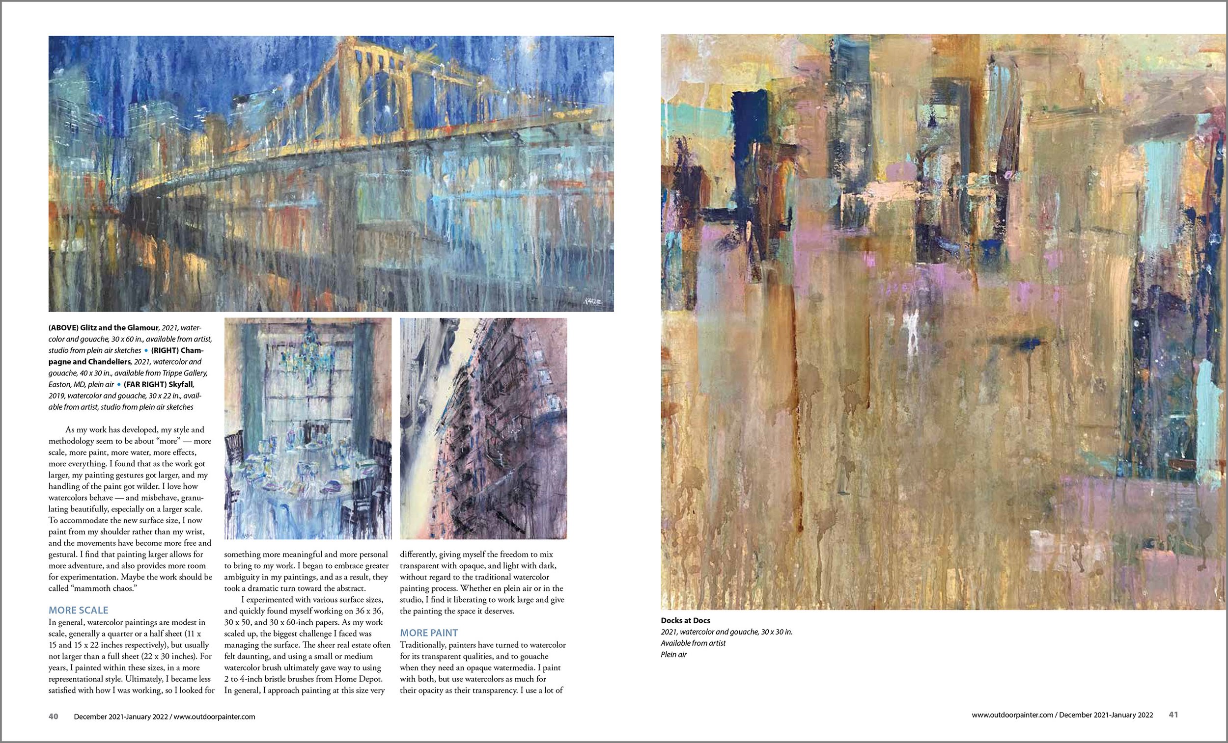
As my work has developed, my style and methodology seem to be about “more” — more scale, more paint, more water, more effects, more everything. I found that as the work got larger, my painting gestures got larger, and my handling of the paint got wilder. I love how watercolors behave — and misbehave, granulating beautifully, especially on a larger scale. To accommodate the new surface size, I now paint from my shoulder rather than my wrist, and the movements have become more free and gestural. I find that painting larger allows for more adventure, and also provides more room for experimentation. Maybe the work should be called “mammoth chaos.”
MORE SCALE
In general, watercolor paintings are modest in scale, generally a quarter or a half sheet (11 x 15 and 15 x 22 inches respectively), but usually not larger than a full sheet (22 x 30 inches). For years, I painted within these sizes, in a more representational style. Ultimately, I became less satisfied with how I was working so I looked for something more meaningful and more personal to bring to my work. I began to embrace greater ambiguity in my paintings, and as a result, they took a dramatic turn toward the abstract.
I experimented with various surface sizes, and quickly found myself working on 36 x 36, 30 x 50, and 30 x 60-inch papers. As my work scaled up, the biggest challenge I faced was managing the surface. The sheer real estate often felt daunting, and using a small or medium watercolor brush ultimately gave way to using 2 to 4-inch bristle brushes from Home Depot. In general, I approach painting at this size very differently, giving myself the freedom to mix transparent with opaque, and light with dark, without regard to the traditional watercolor painting process. Whether en plein air or in the studio, I find it liberating to work large and give the painting the space it deserves.

MORE PAINT
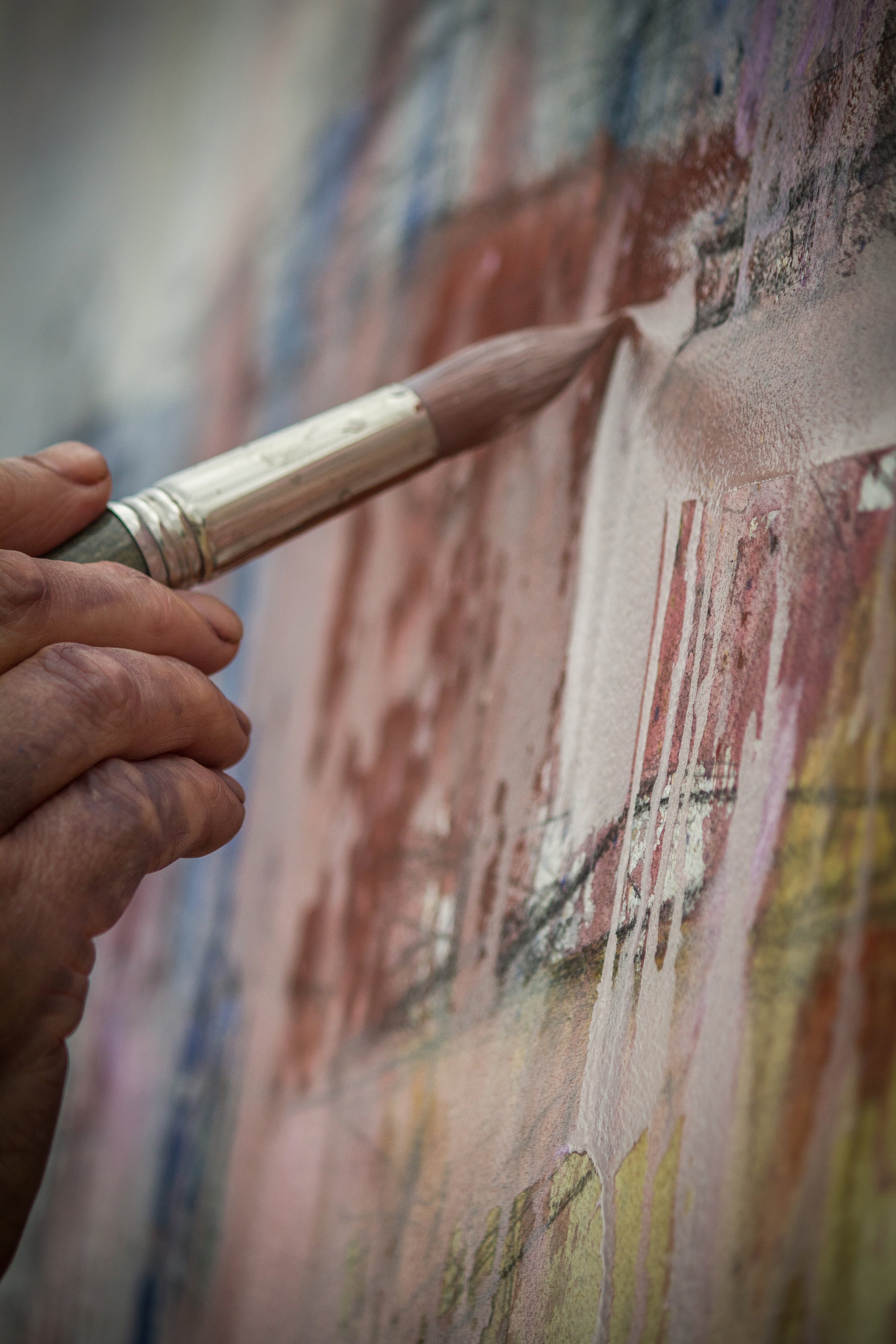
Traditionally, painters have turned to watercolor for its transparent qualities, and to gouache when they need an opaque watermedia. I paint with both, but use watercolors as much for their opacity as their transparency. I use a lot of paint, much more than most watercolorists I imagine, and would compare my technique more to that of an oil painter.
Most often I allow my colors to mix and mingle right on the painting surface, or build up them up on my brush before applying them to the paper, rather than pre-mix them on my palette. I vary my applications, from thick, gooey strokes to watery mixtures. I build brush marks into layers and add water, which can turn a simple brushstroke into one that can drip for three feet. I also squeeze paint directly out of the tube, or apply it with a variety of tools to achieve a cake-like application. Once it’s applied, I often introduce a stream of water to break things up and distribute remnants of the color.
When it comes to gouache, I only use the color white, which can be used straight out of the tube for an opaque quality, or mixed with various amounts of water to achieve different consistencies, resulting in a range of transparencies. Mixed with water, white gouache behaves rather recklessly, creating unique effects unlike anything else — it can spatter, streak, brush, drip, and more. Used both ways, the medium has become critical to my work.

MORE WATER
The essence of watercolor painting is the relationship between water and paint— it’s about manipulating quantities of one in relation to the other. For any watercolorist, water is what makes the paint fluid enough to apply it to the substrate. In my work, water becomes a much more active player. As I start a painting, I mix up and apply a slurry of paint. At this point water is my most valuable tool. I can spray or drizzle it from above and let it run through the paint to create channels of texture, or encourage any number of other interesting interactions to take place on the paper. I can also use it to scrub the paint with a brush or my hands to create surface variety.
Even while the surface is drying, I introduce water at various stages, deconstructing portions of the painting by using water on my fingers, brushes, or other tools to wipe sections or edges out. In the end, I might use up to three gallons of water per sitting, with most paintings demanding multiple sittings.
THE EVOLUTION OF STYLE AND SUBJECT
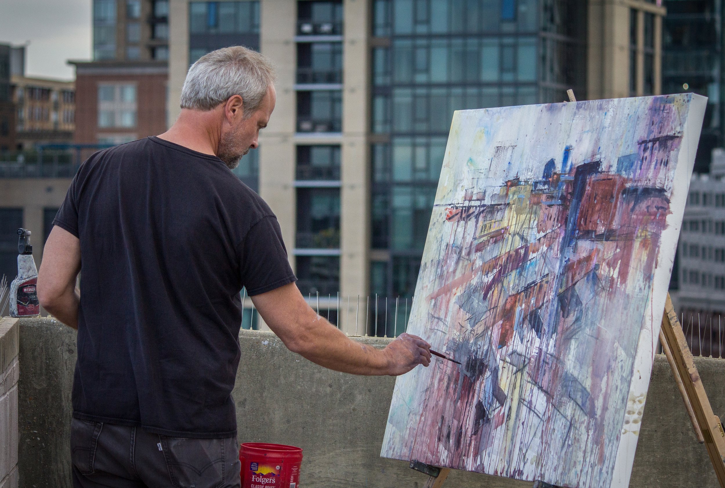
As my style has evolved, so has my approach to my main subject matter — cityscapes, which require a certain grittiness that my technique delivers. In general, the most dramatic developments of my process have been refined in the studio, but it has felt very natural to bring that discipline to a plein air environment. Of course, painting larger has required getting some larger gear, but in general, scaling up has not been a problem. I always keep a few gallons of water in tow, but if I can get a good parking spot near my subject, with access to running water and a power source so I can use a hair dryer to dry my work between passes, I’ve got an ideal situation.
Currently, there are only a few plein air events that truly welcome large paintings. In fact, this year’s Plein Air Easton was the first one where I completed several large pieces. For the most part, being different is a positive. My work is bold and unique, but I tend to get good feedback and sell well. Sometimes it takes a certain someone to gravitate to it, someone who likely has an appreciation for abstract art. If everyone liked my work, I’m not sure that would be an indication that I’m pushing myself hard enough. I think great work draws attention, so I always strive to do great work.

ARTIST’S BIO
Ken Karlic paints in oil and acrylic, as well as watercolor. “Each medium holds something special and informs the other,” he says. “Every time I go to the easel I learn something new that I will fold into future work.”
DEMONSTRATION
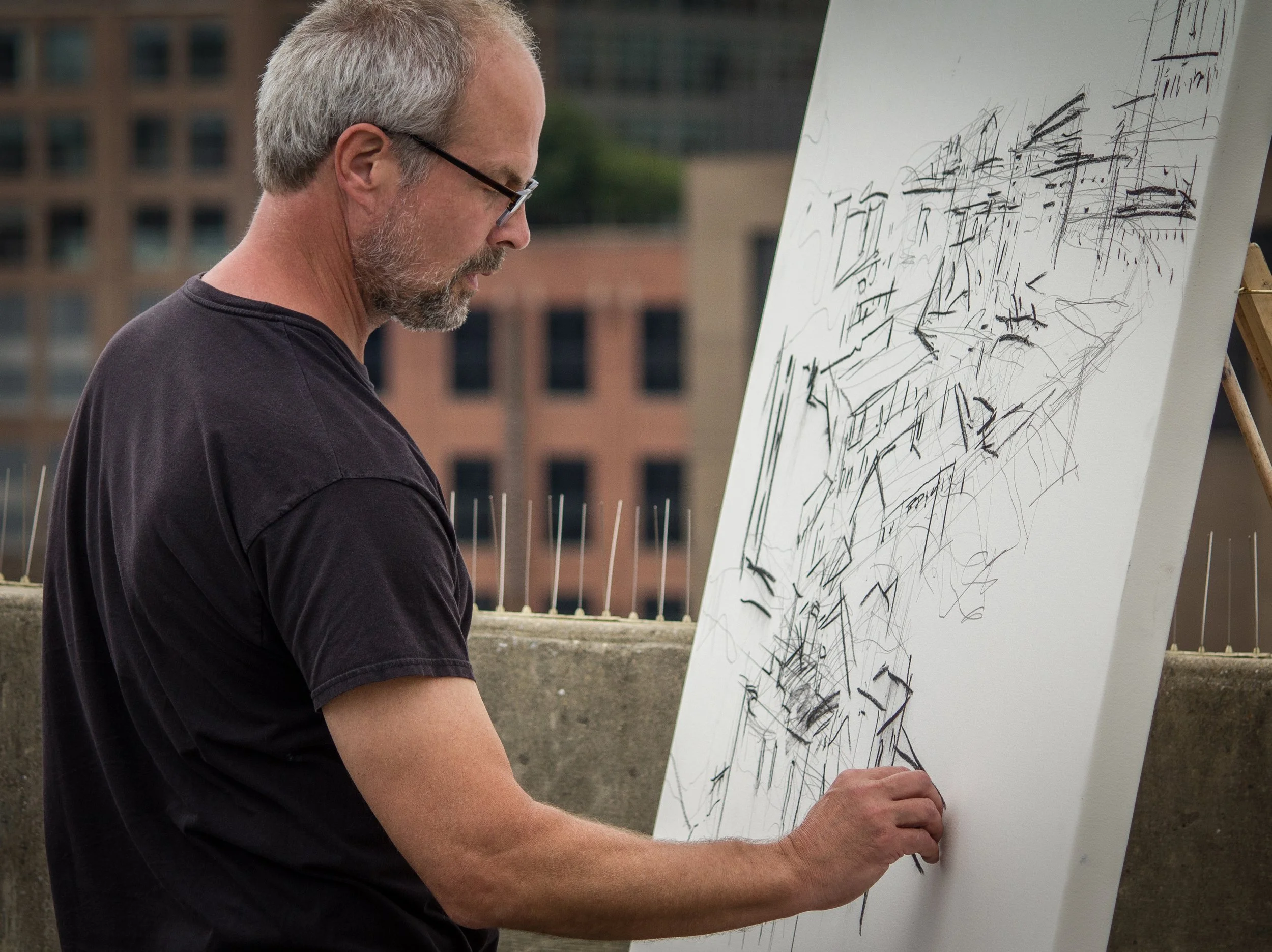
Step 1
Set up on the top level of a parking garage in downtown Baltimore, I loosely sketch the composition in pencil, then strengthen some lines with vine charcoal.

Step 2
I review my gear, including a tackle box full of watercolor paints, palette surfaces, and a selection of large 2 to 4-inch brushes, in preparation for adding color.
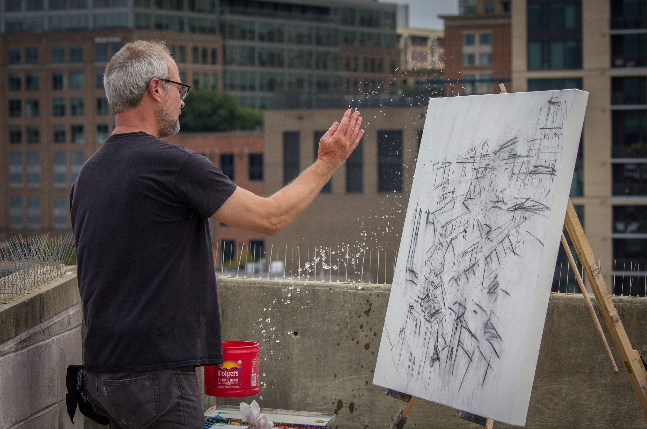
Step 3
I dip my hand in a water container and arbitrarily moisten the paper.

Step 4
I start painting at the top of this 36 x 48-inch surface, allowing gravity to work its magic, and embracing the running and dripping of watercolor throughout.

Step 5
My palette is quickly covered with a slurry of paint and water, and I periodically tip the palette into my hand then toss the mixture onto the painting. I like to create a variety of marks, from deliberate to arbitrary.
Step 6
Slowing things down a bit, I use a smaller brush with white gouache in order to create a veiled effect in an area of the painting.

Step 7
With a large passage roughly blocked in, I continue to work the drips into the painting as well as refine the overall design.
Step 8
I put the finishing touches on my first day’s effort. I will return to this site a total of three times in consecutive days.
Finished Painting
Capturing the patchwork and layered effects inherent in an aerial view, the finished work reveals thick layers of paint applied over the course of several sessions, making for a rich and evocative painting.

View From the Seventh
2021, watercolor and gouache, 36 x 48 in.
Available from artist
Plein air
PRESENTATION MATTERS
Traditionally, a watercolor would be painted on paper, mounted on a backing board, matted, and then framed behind glass or plexiglass. While I appreciate this presentation, I admire the directness with which an oil painting can be experienced. Using varnish allows me to remove the glass barrier while still protecting the work from UV rays.
When I first started painting large in the studio, I would trim and mount paper to the wall. Now I treat my paper (Arches cold-pressed from a roll) like canvas by wetting it, trimming it, then stretching it onto a cradled panel, which allows me greater freedom to paint anywhere. To the finished painting, I apply several coats of varnish and display it in a black floater frame, a contemporary style that suits my work.
IMAGES/CAPTIONS WHICH APPEAR IN THIS ARTICLE

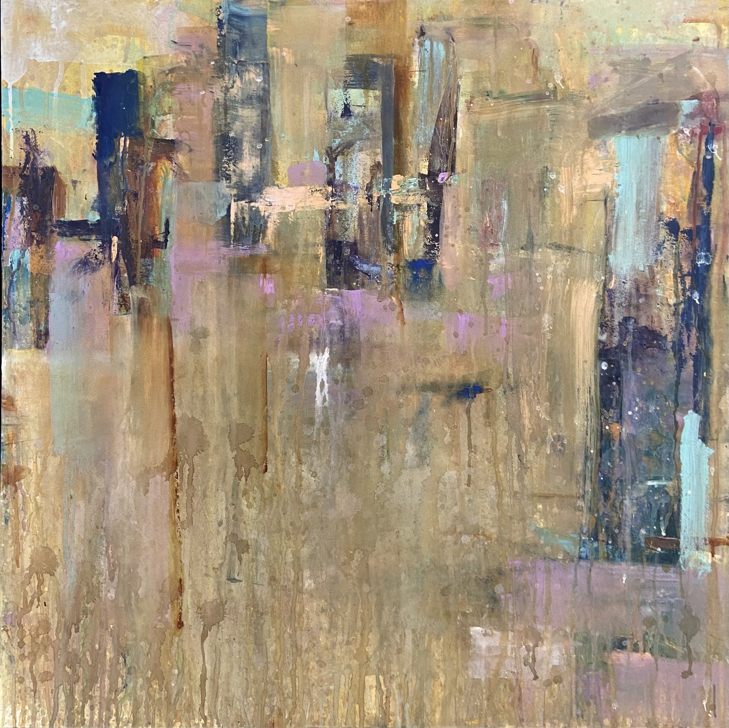
Glitz and the Glamour
2021, watercolor and gouache, 30 x 60 in.
Available from artist
Studio from plein air sketches
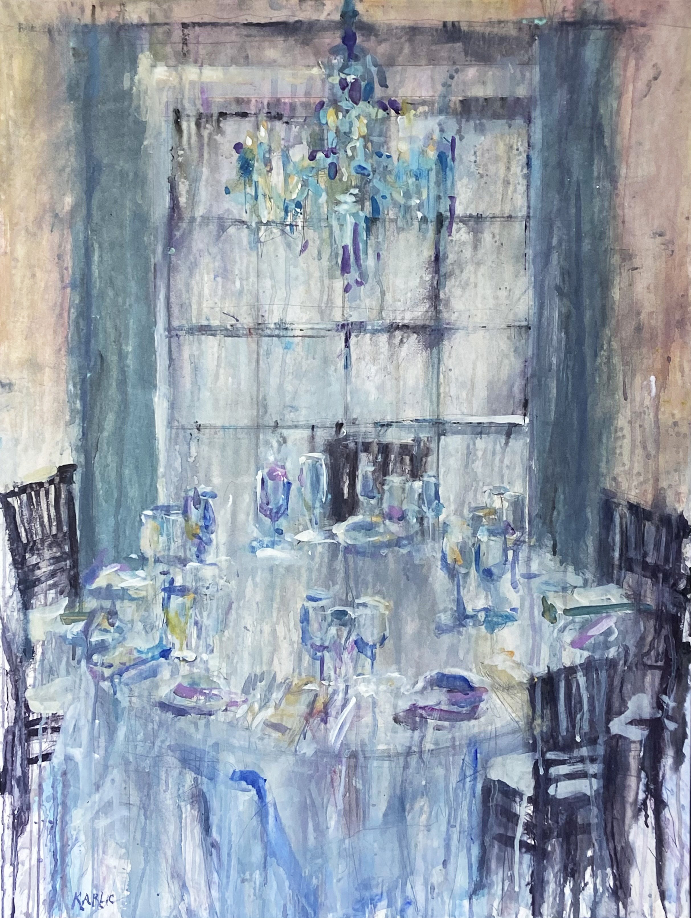
Champagne and Chandeliers
2021, watercolor and gouache, 40 x 30 in.
Available from Trippe Gallery, Easton, MD
Plein air
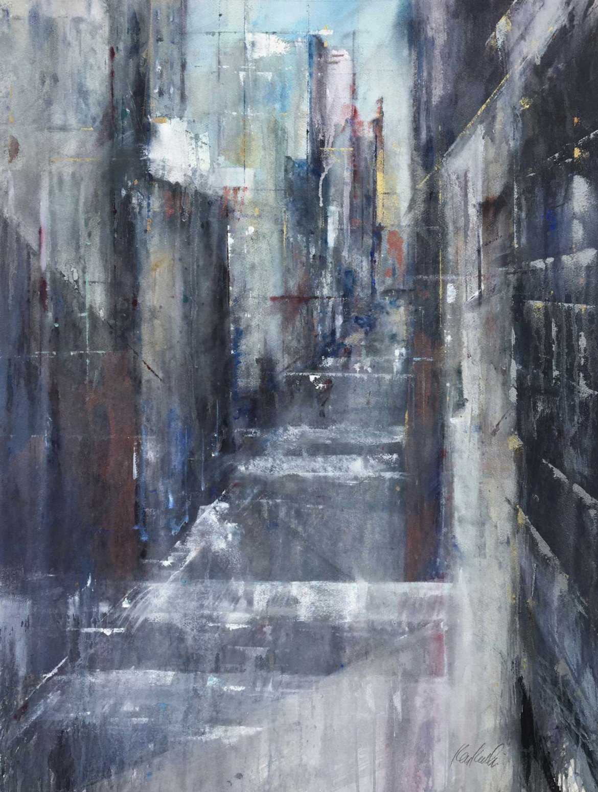
Corridor
2018, watercolor and gouache, 40 x 30 in.
Available from artist
Studio from plein air sketches
Docks at Docs
2021, watercolor and gouache, 30 x 30 in.
Available from artist
Plein air

Skyfall
2019, watercolor and gouache, 30 x 22 in.
Available from artist
Studio from plein air sketches

Passenger Service
2019, watercolor, 20 x 24 in.
Plein air
Private collection

Suspension
2021, watercolor and gouache, 30 x 30 in.
Available from artist
Studio from plein air sketches

Wye Mills
2019, watercolor and gouache, 20 x 28 in.
Available from artist
Plein air